The problem
Branded like a meeting.
For years, POC NOW ran under the association’s logo. It looked like a members’ meeting, not the industry summit POCMA wanted it to be.
For 2026, the summit needed a brand of its own: one that stood apart from POCMA’s identity and told pharma brand leaders this was the day to be in the room.
The concept
Follow the patient.
Point-of-care marketing happens wherever patients meet care: the pharmacy, the exam room, the hospital room, the video visit. So I drew the path between them, one looping line in purple, blue and green. It became the logo, then the whole identity.
A line is easy to stretch: onto a badge, across a stage wall, through a room, and still one brand.
The idea
A summit isn’t a meeting. It’s a route people follow.
How it got made
From a name badge to a stage wall.
The same loop had to hold up at every size and on every surface: fabric, acrylic, card stock and screens. I designed and produced the identity, then art directed production across all of it, so nothing drifted from one piece to the next.
| Deliverable | Format / spec | My part |
|---|---|---|
| Summit identity | Logo, palette, the loop and the striped border | Art directed and designed |
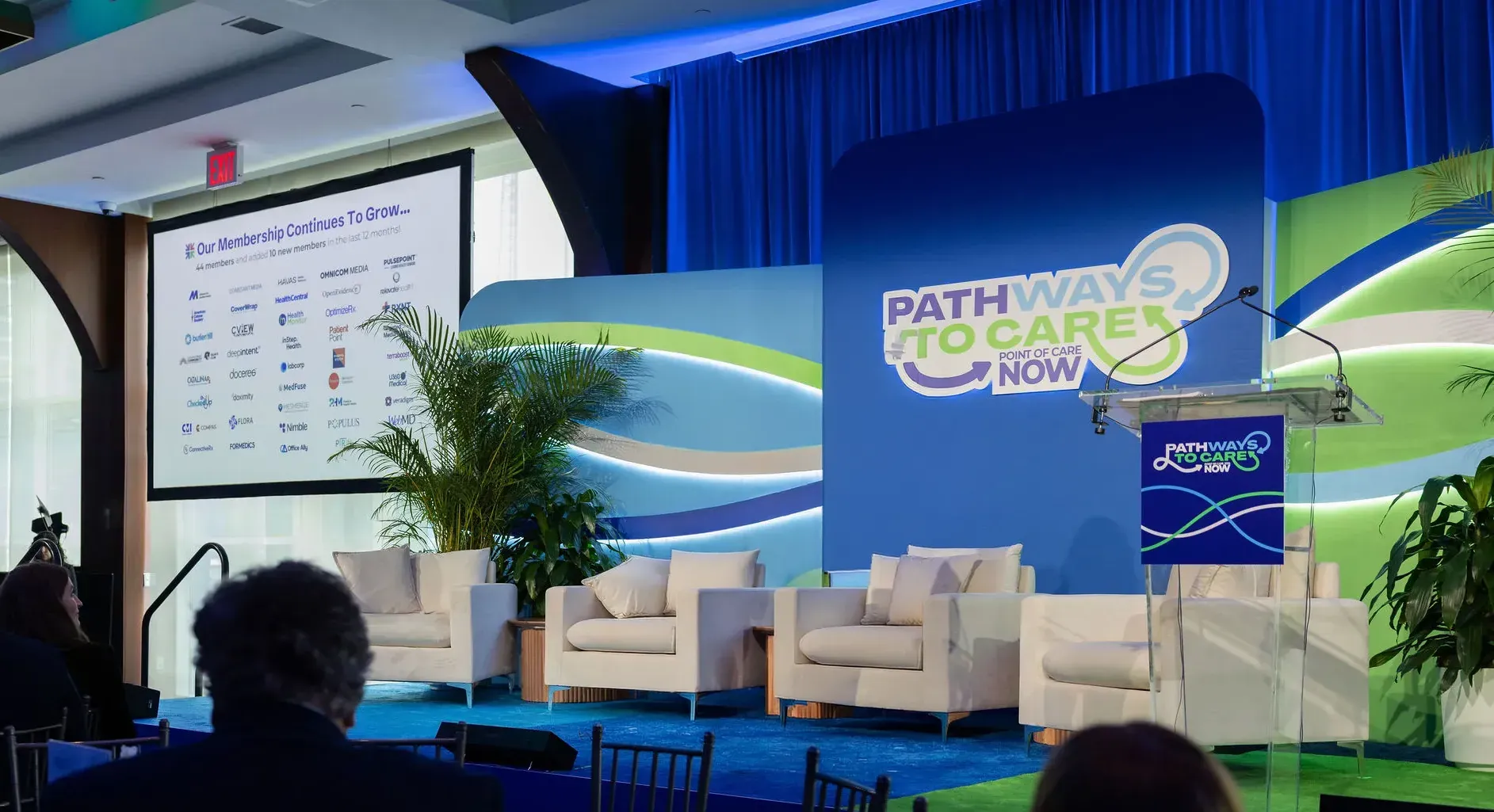
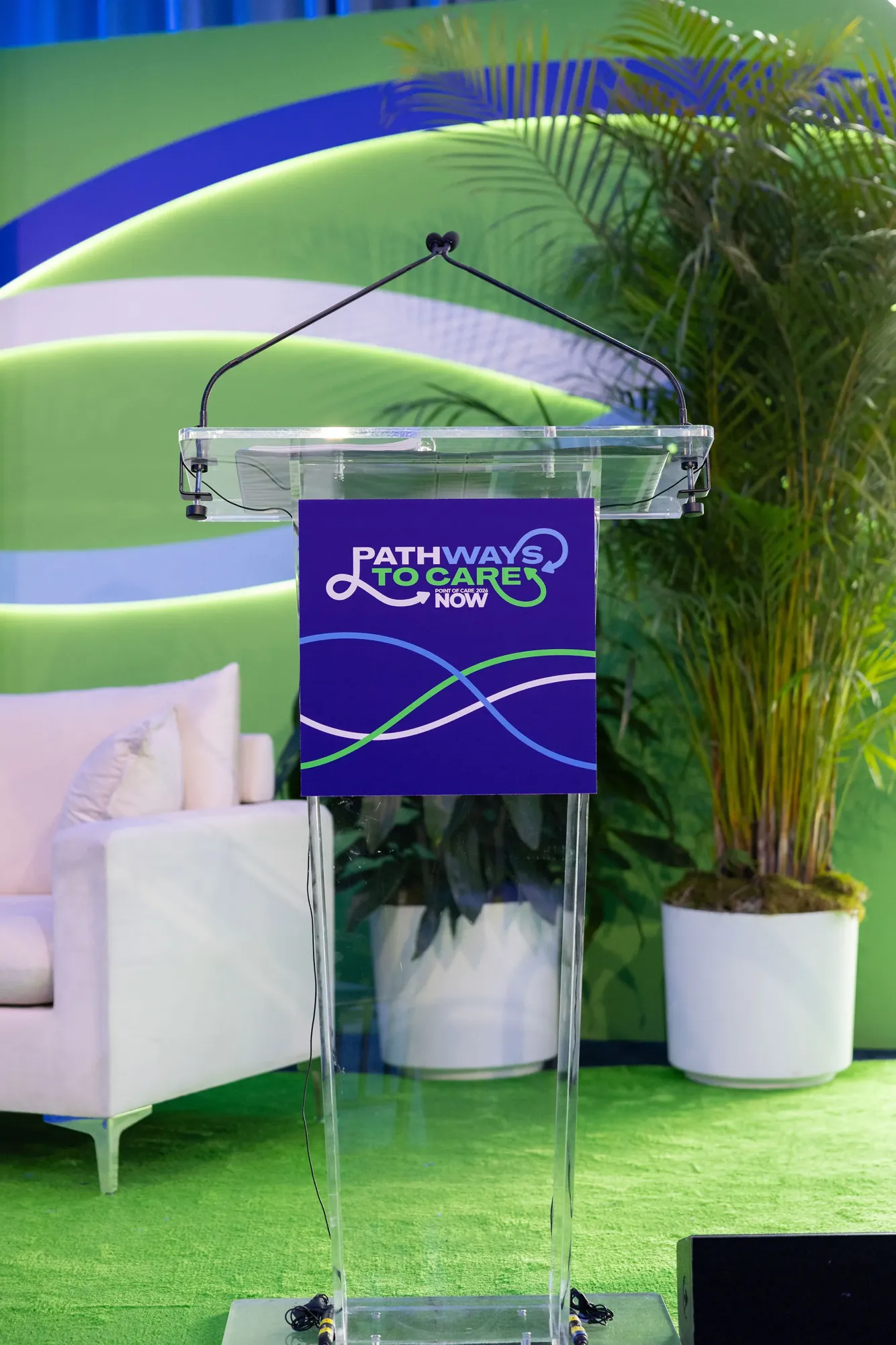
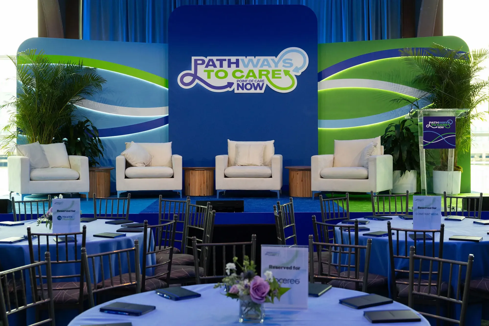
| Main stage and podium | 20′ × 10′ stage backdrop, plus the podium sign | Art directed and designed |
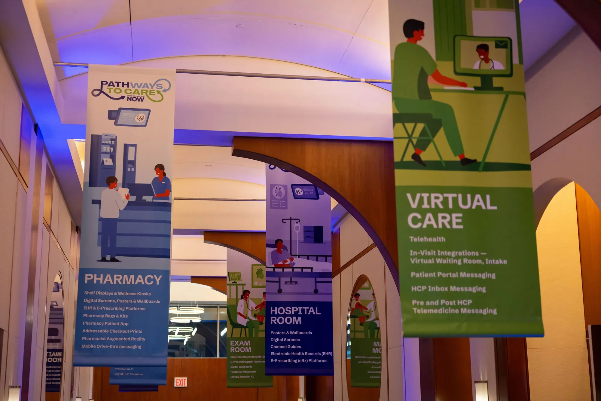
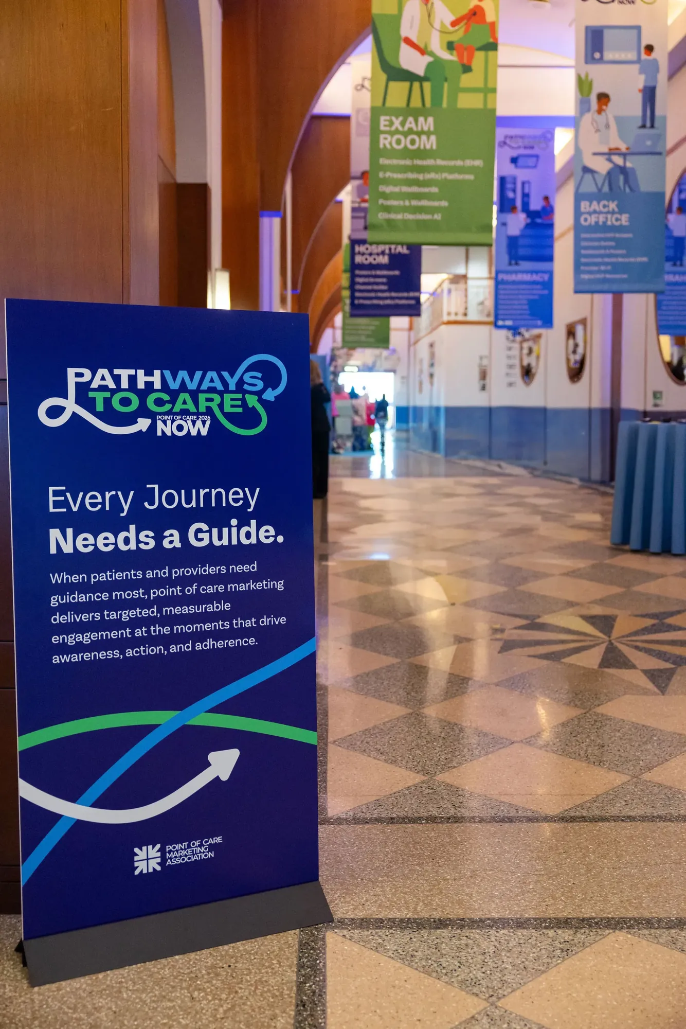
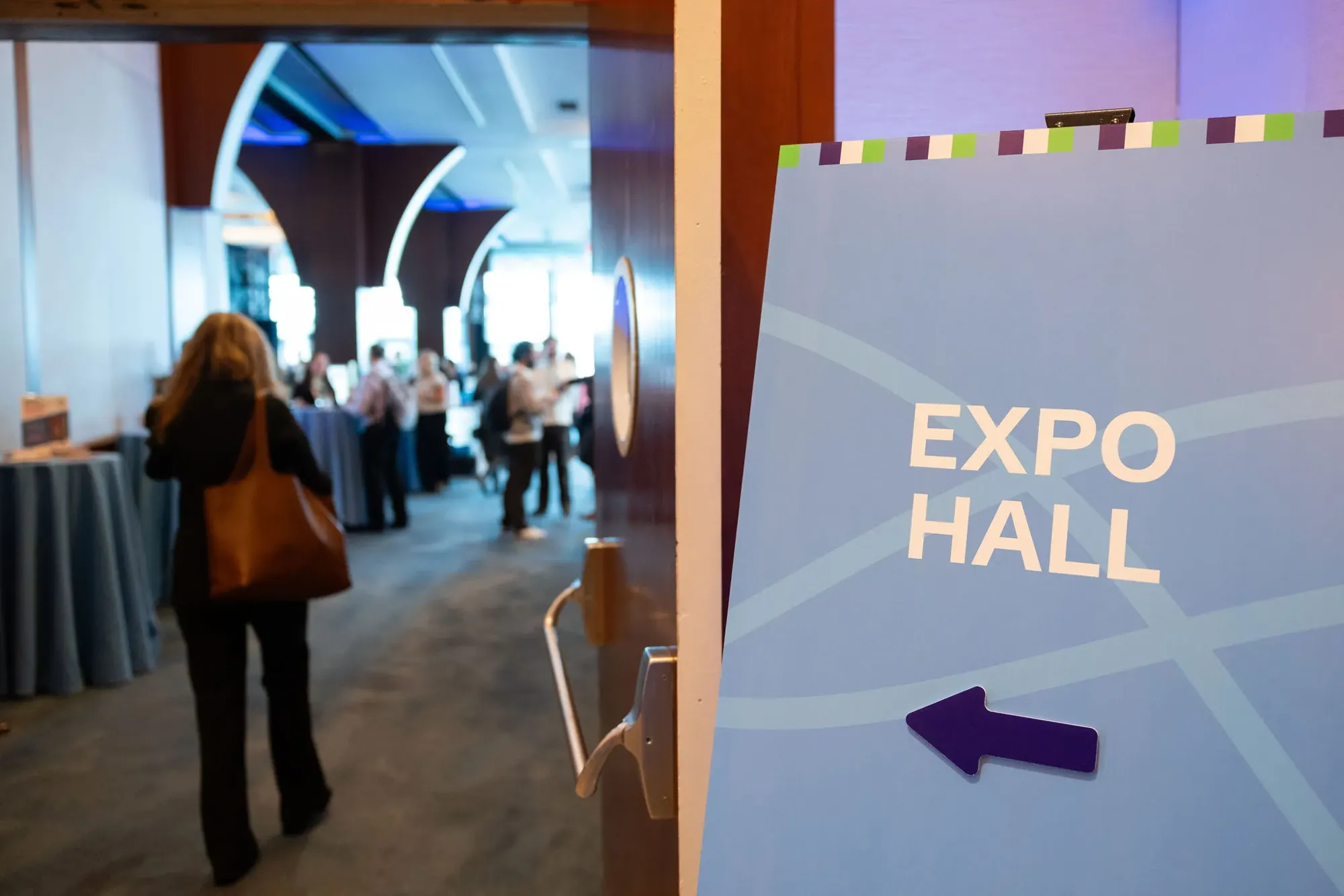
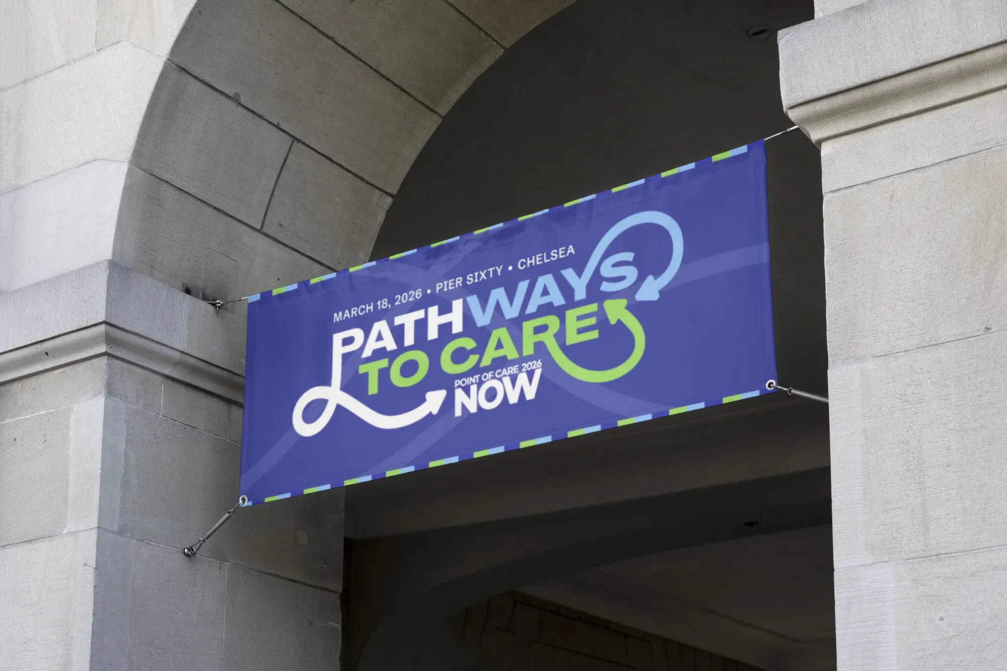
| Wayfinding | Illustrated hanging banners for five points of care, plus entrance and directional signs | Designed |
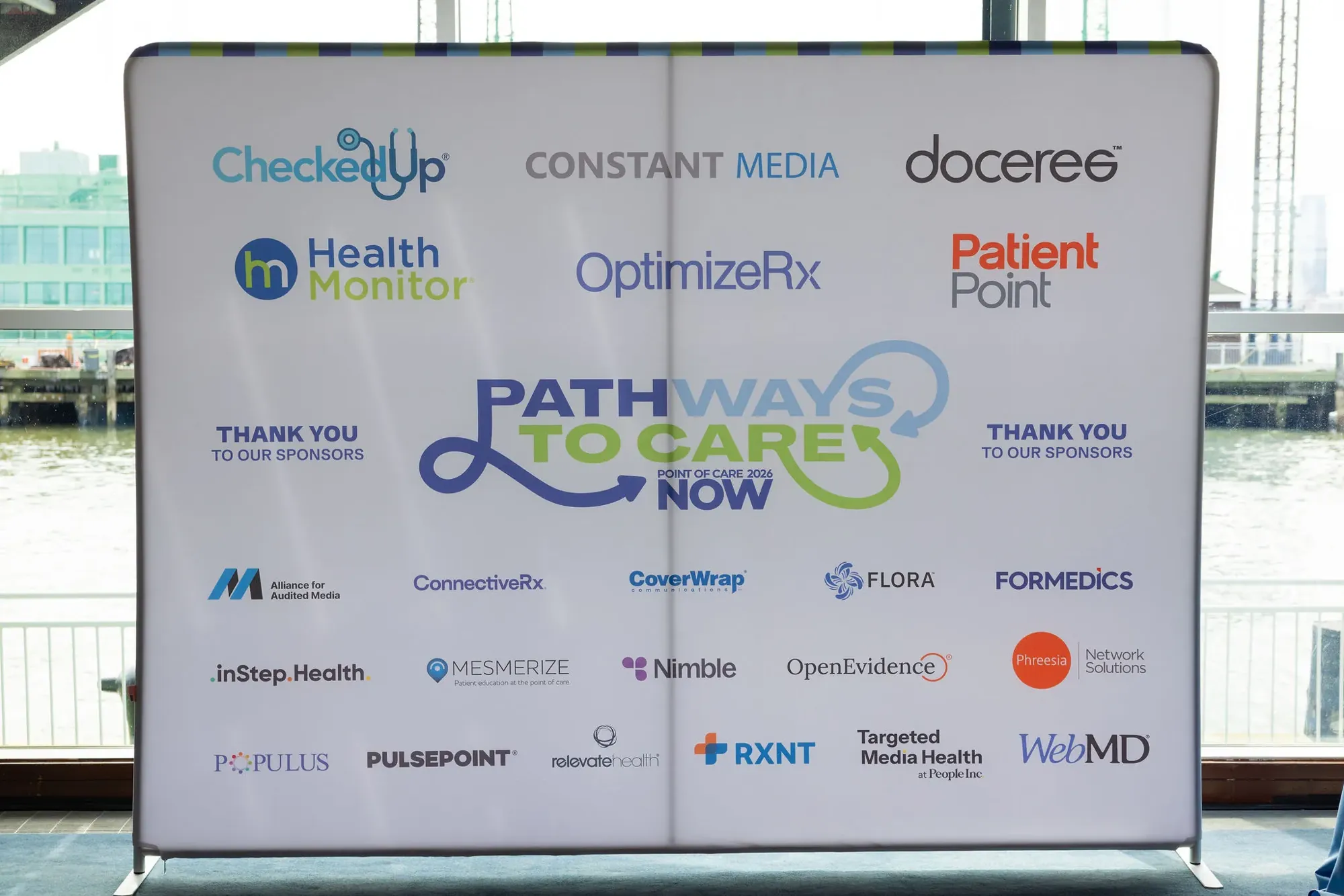
| Sponsor wall | 12′ × 10′ vinyl | Designed |
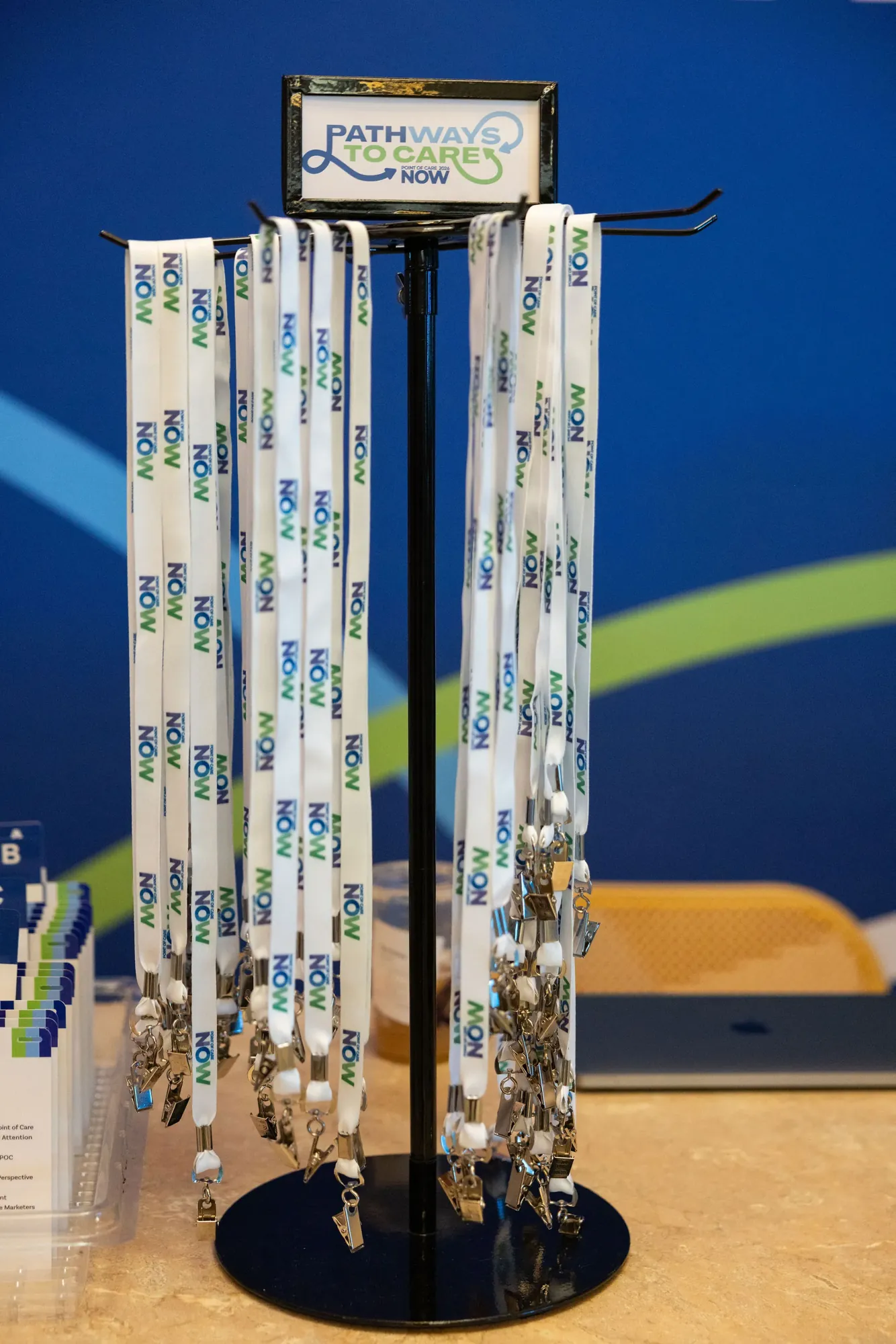
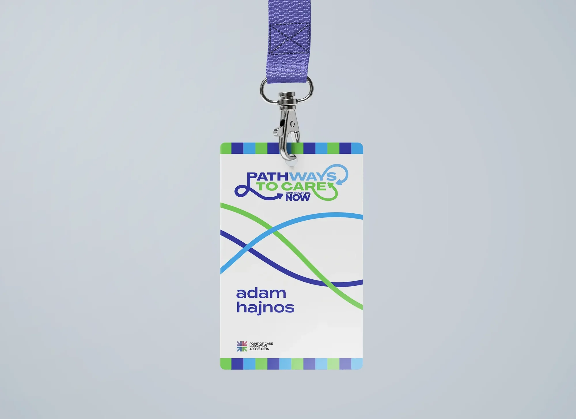
| Badges, lanyards, agendas | 5″ × 7″ badges and agenda cards, printed lanyards | Designed |
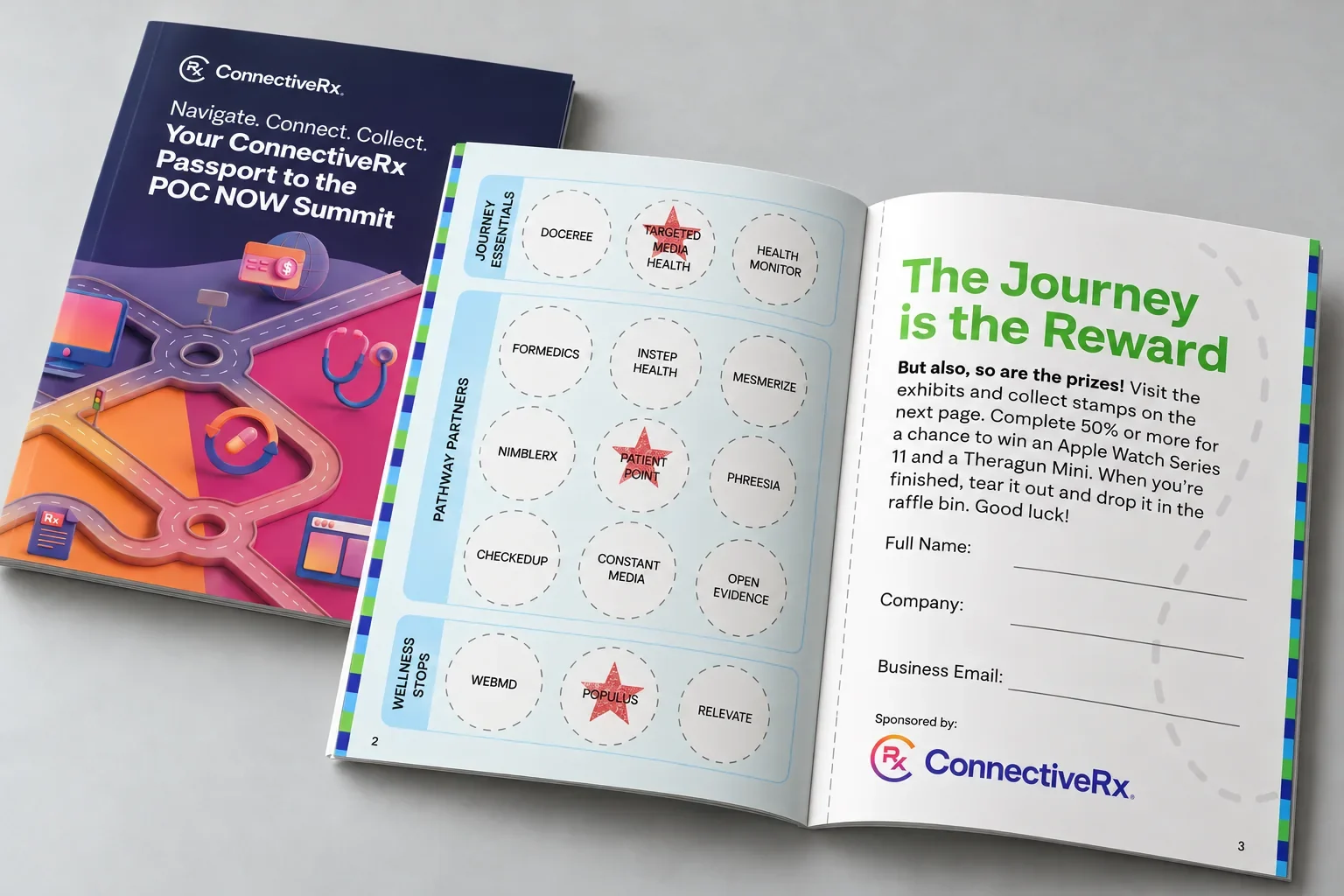
| Passport and raffle | 5″ × 7″ handout booklet and raffle signage | Designed |
| Website and ads | Event site, registration path, HTML5 display ads | Designed; built the site in the CMS |
- Attendees
- 400+
- Sponsors
- 20
- Venue · New York, NY
- Pier Sixty
On the pier
The pier became the map.
Pier Sixty gave the summit a big, bright room on the Hudson. I used the concept to organize it. Hanging banners turned each point of care into a place, from the pharmacy and the exam room to virtual care and the back office, so walking the floor meant walking the patient’s route.
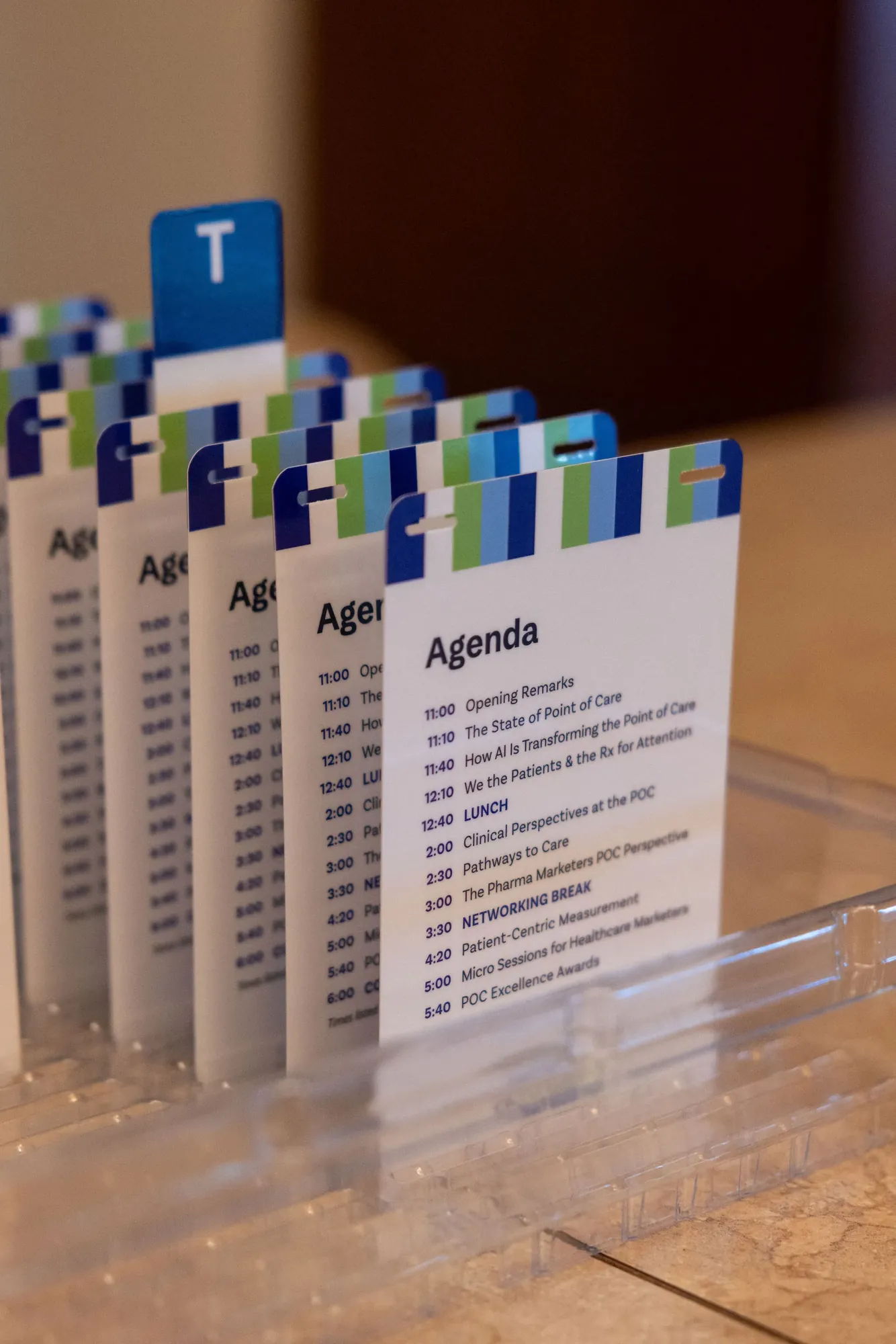
Every other piece carried the same parts: the loop on the stage and podium, its arrow on the signs, a striped edge on the sponsor wall and agenda cards, and NOW printed down every lanyard.
The detail
The stripes did the stitching. One striped edge ran across the sponsor wall, the signs and the agenda cards, so even the smallest piece read as POC NOW.
The leave-behind
Stamp by stamp.
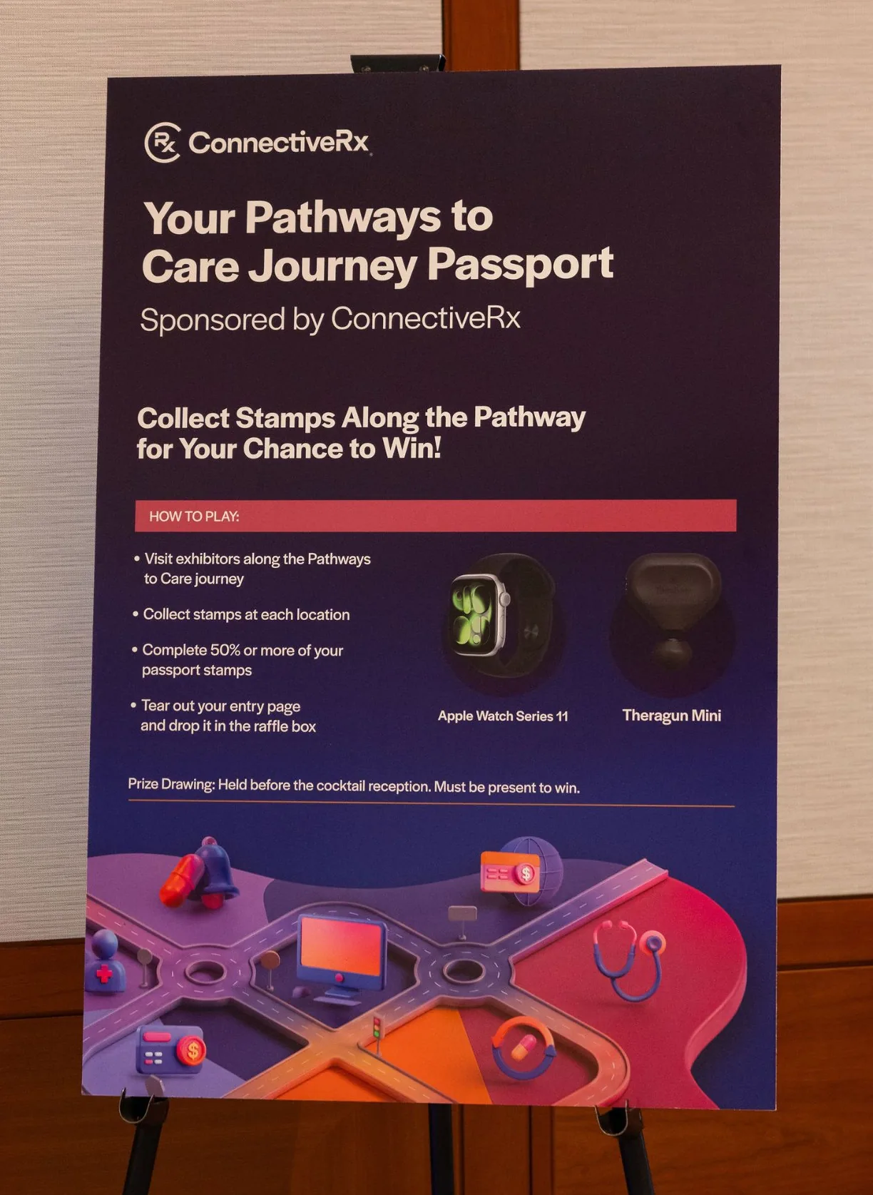
A printed program is easy to throw away. So the program became a passport: a 5″ × 7″ booklet with a stamp for every exhibitor along the Pathways to Care route. Collect at least half the stamps, tear out the entry page, drop it in the raffle box, and be there for the drawing before the cocktail reception.
Guests got a reason to visit every booth, and sponsors got a reason to start a conversation. Then it had to be made: the booklet, the stamp grid, the sponsor pages and the raffle signs, co-branded with ConnectiveRx, which sponsored it.
Before the pier
The route started online.
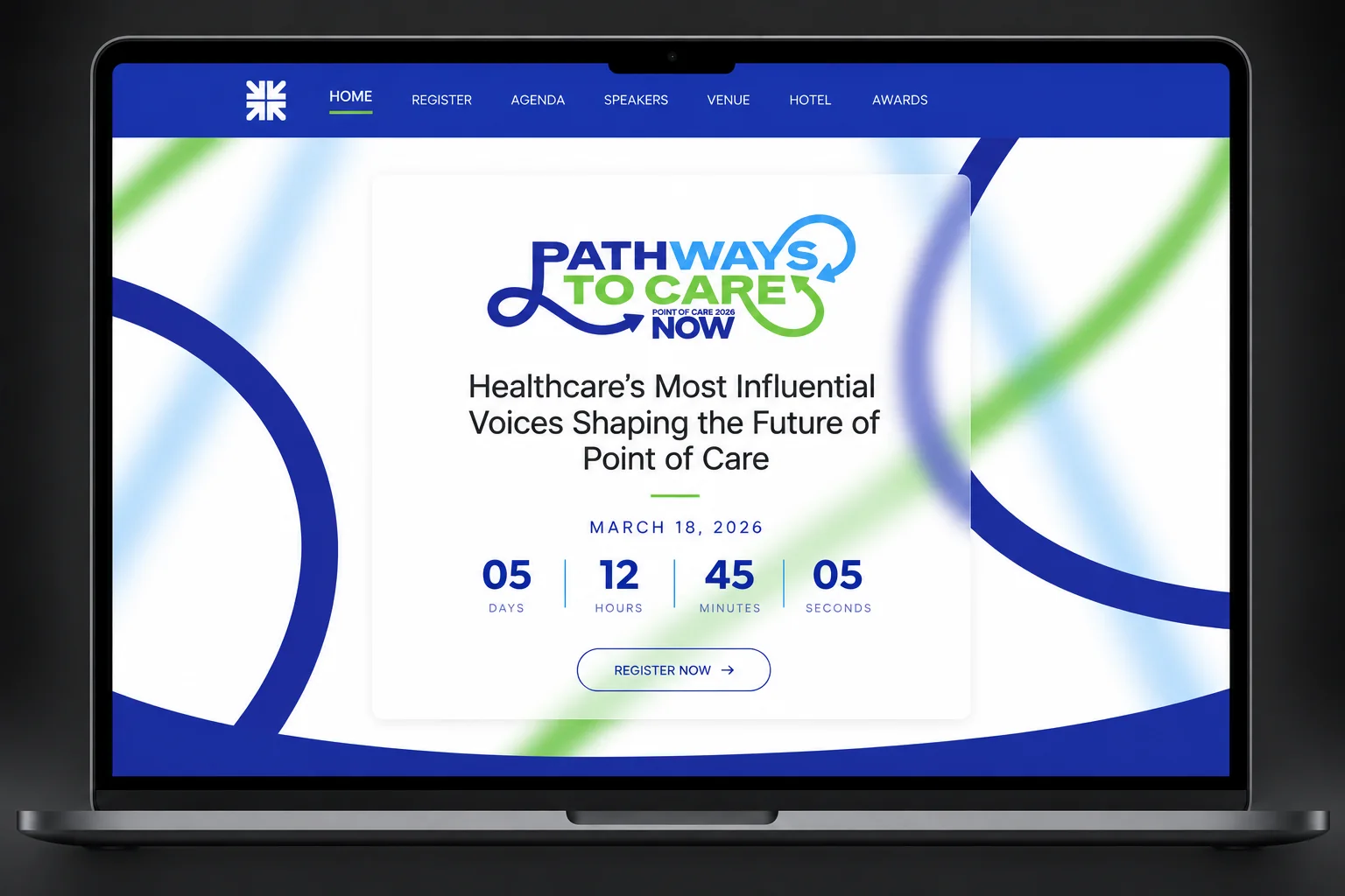
The site and ads used the same loop, palette and type, so the summit looked like one event before anyone arrived. Their job was simple: get from the first ad to a finished registration with nothing in the way.
“Every element felt cohesive and intentional. Seeing [the] work come together in real life was truly impressive.”
What happened
One summit, one story.
More than 400 attendees and 20 sponsors filled Pier Sixty for one day, and every one of them moved through the same system: from the first ad to the stage, the signs, the badge around their neck and the passport in their bag.
Why it holds together
The loop never broke.
One line, one palette and one striped edge ran through the ads, the site, the stage, the badges and the passport. Guests met one event, whether they found it online, on the pier or in their bag.
Bring me
the problem.
Hiring a Senior Designer, Art Director, or hands-on Creative Director? If you need design strategy and the hands to carry it out, on brand down to the last file, I’d like to hear about it.
- LocationRaleigh, NC · Remote or hybrid
- Emailhello@adamhajnos.com
- LinkedInlinkedin.com/in/adam-hajnos
- RésuméView résumé