The brief
Not a crowd. A feeling.
Pinetop is a local craft distiller. Gin is where its heart lives, and North Carolina is a close second.
The founders first pictured their drinker as themselves: finance guys who go camping on the weekend. That audience was too small. The real one was anyone who wanted to feel North Carolina in a glass, to hear the mountains and feel sand between their toes.
Where it starts
Mountains to the sea.
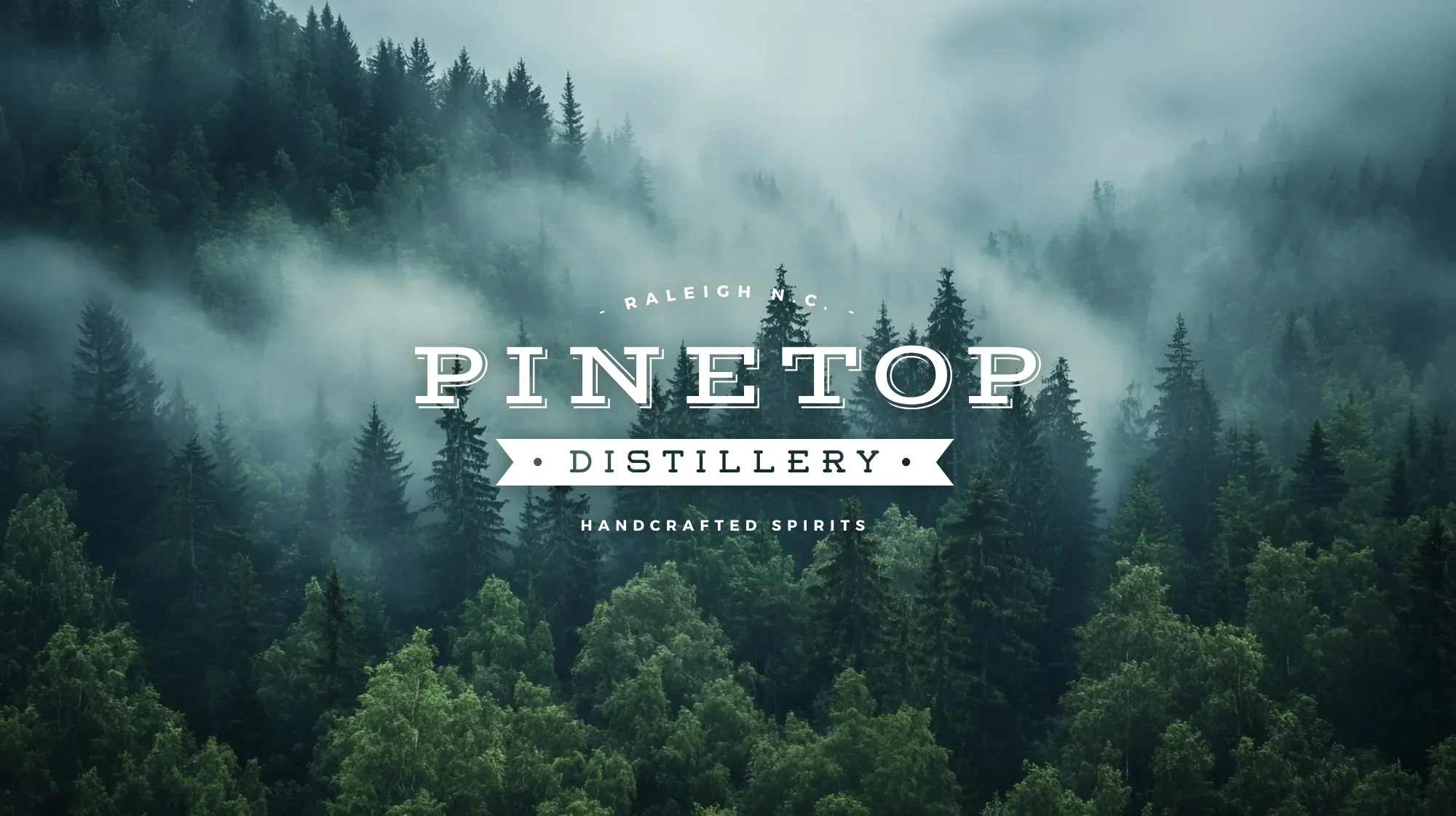
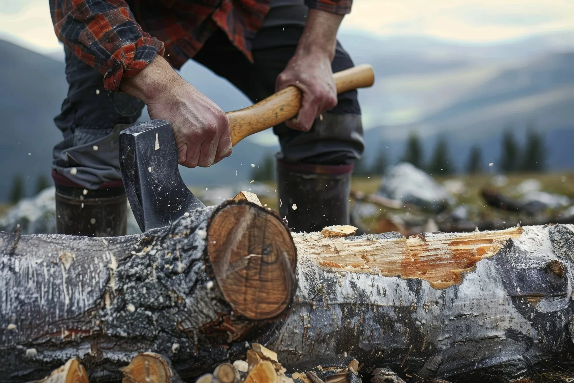
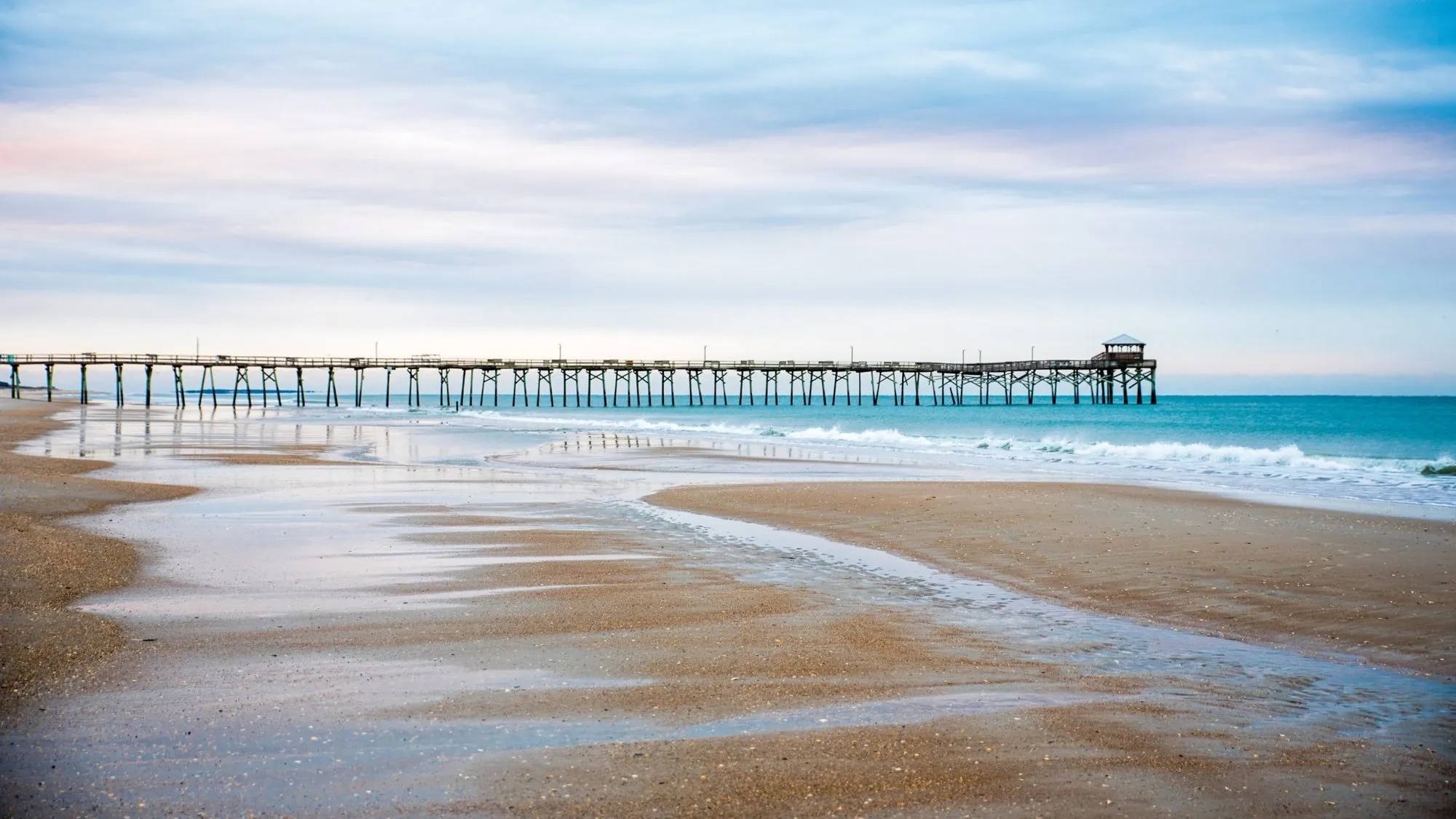
That feeling has two ends. In the west, pine, mist and woodsmoke on the Blue Ridge. In the east, dunes, piers and salt air on the coast. The brand had to carry you from one to the other.
The identity
Etched in bark, soaked in mist.
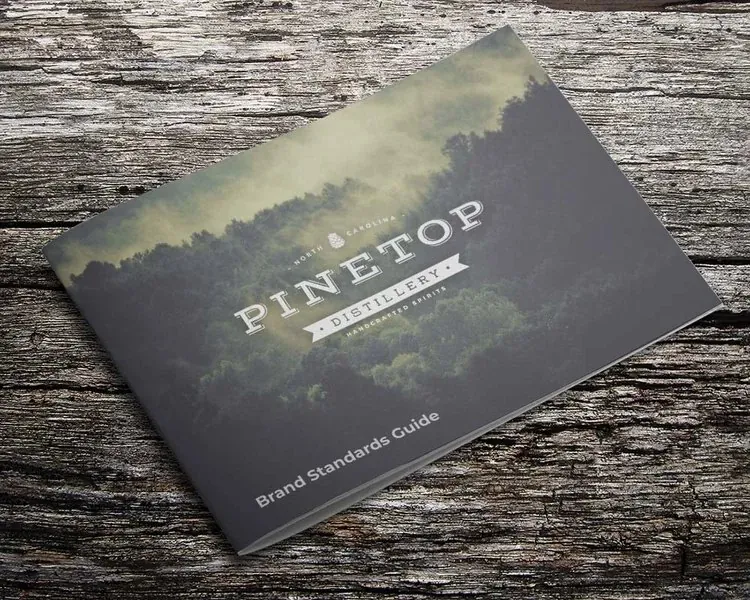
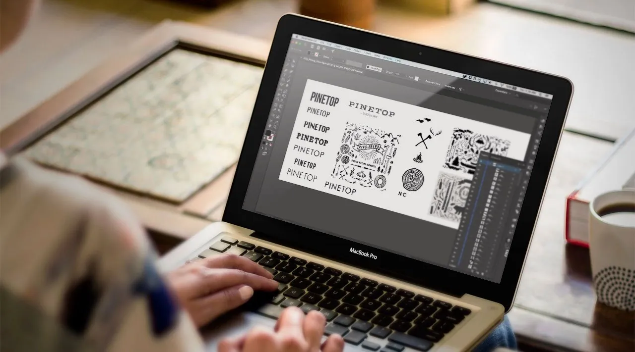
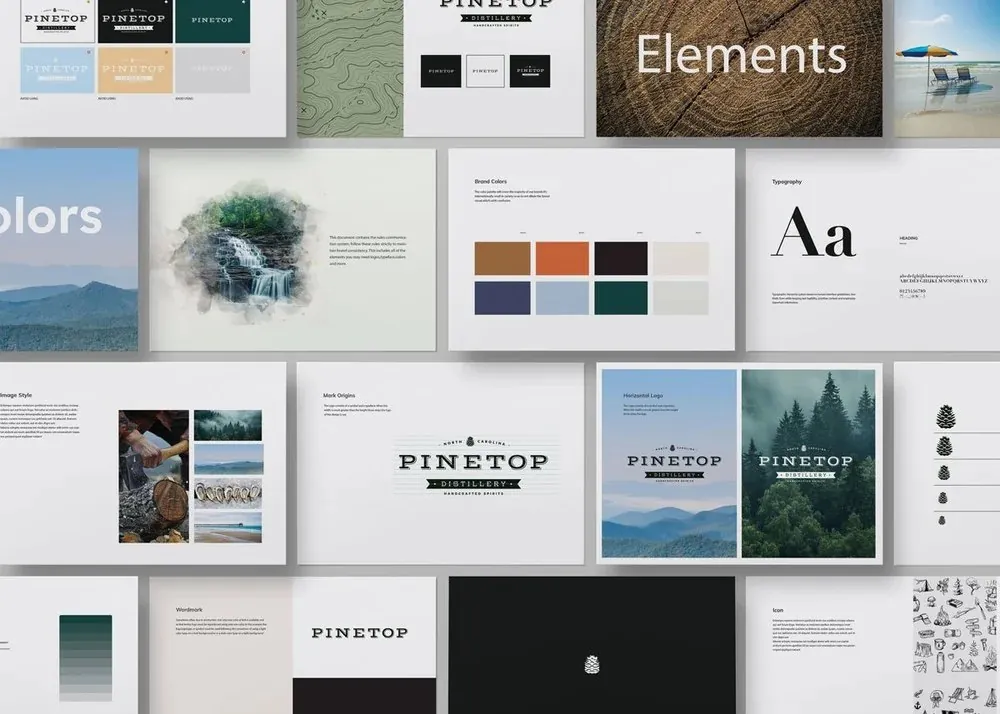
I wanted the brand to look like it had been weathered into place. A slab serif and whiskey-label details borrowed from 19th-century Appalachia, hand-drawn elements instead of clean automation, and a palette of earth and sky: tobacco, coral and pine, navy and sky blue, grounded by charcoal and cream.
Southern signage gave it a visual vocabulary people already knew. Worn edges and sanded textures kept it from feeling like a costume.
The idea
Carolina, captured in a bottle.
The packaging
Pour a little. See a little more.
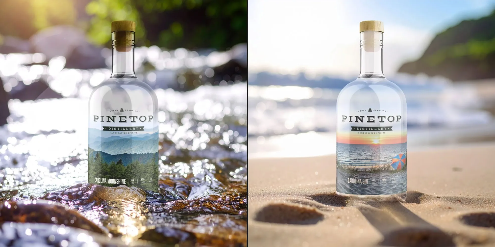
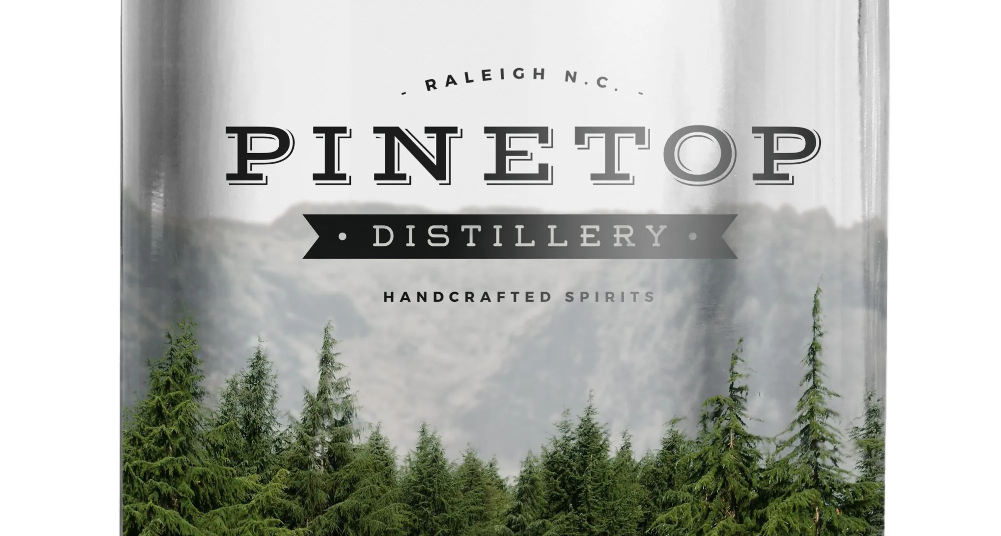
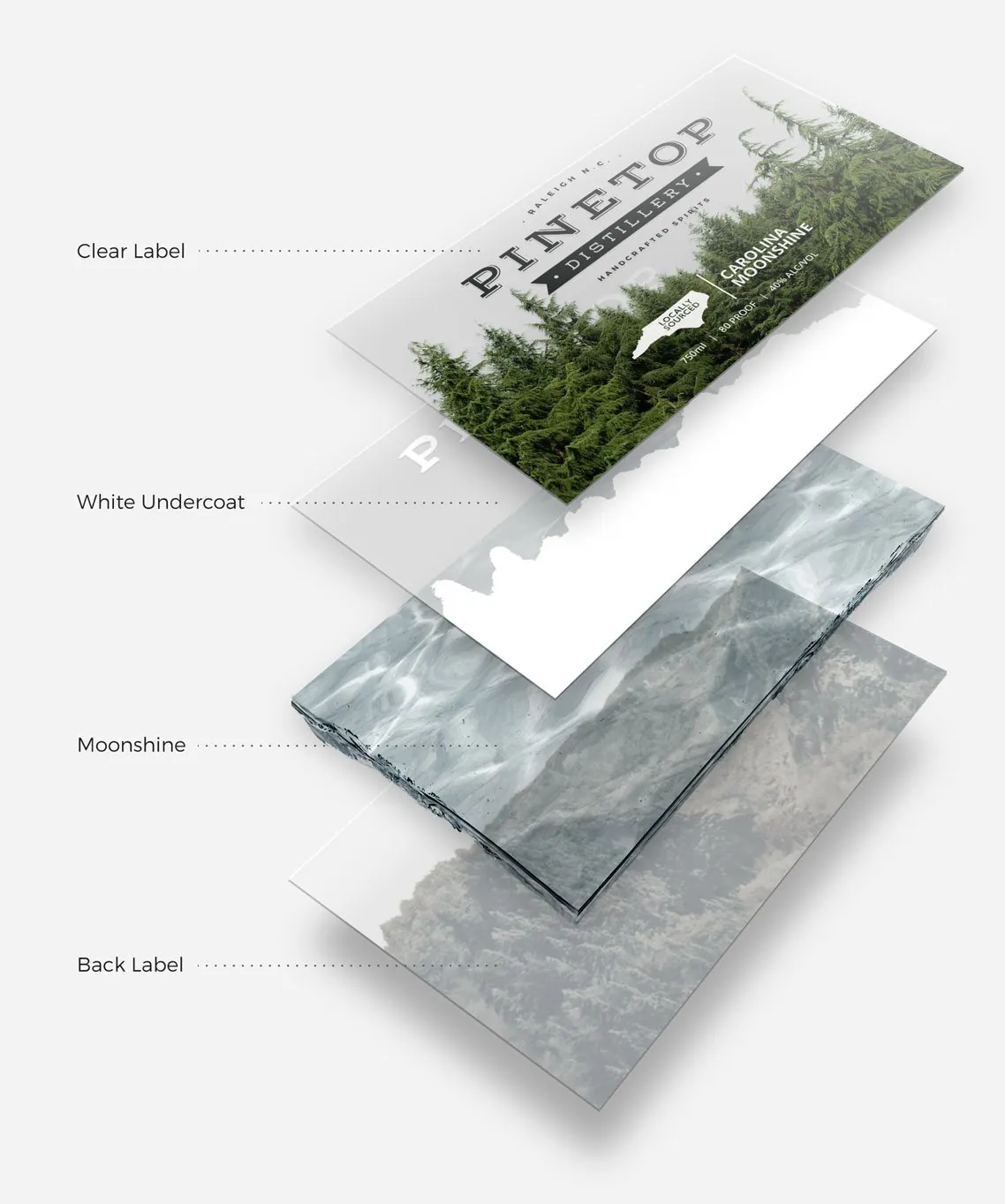
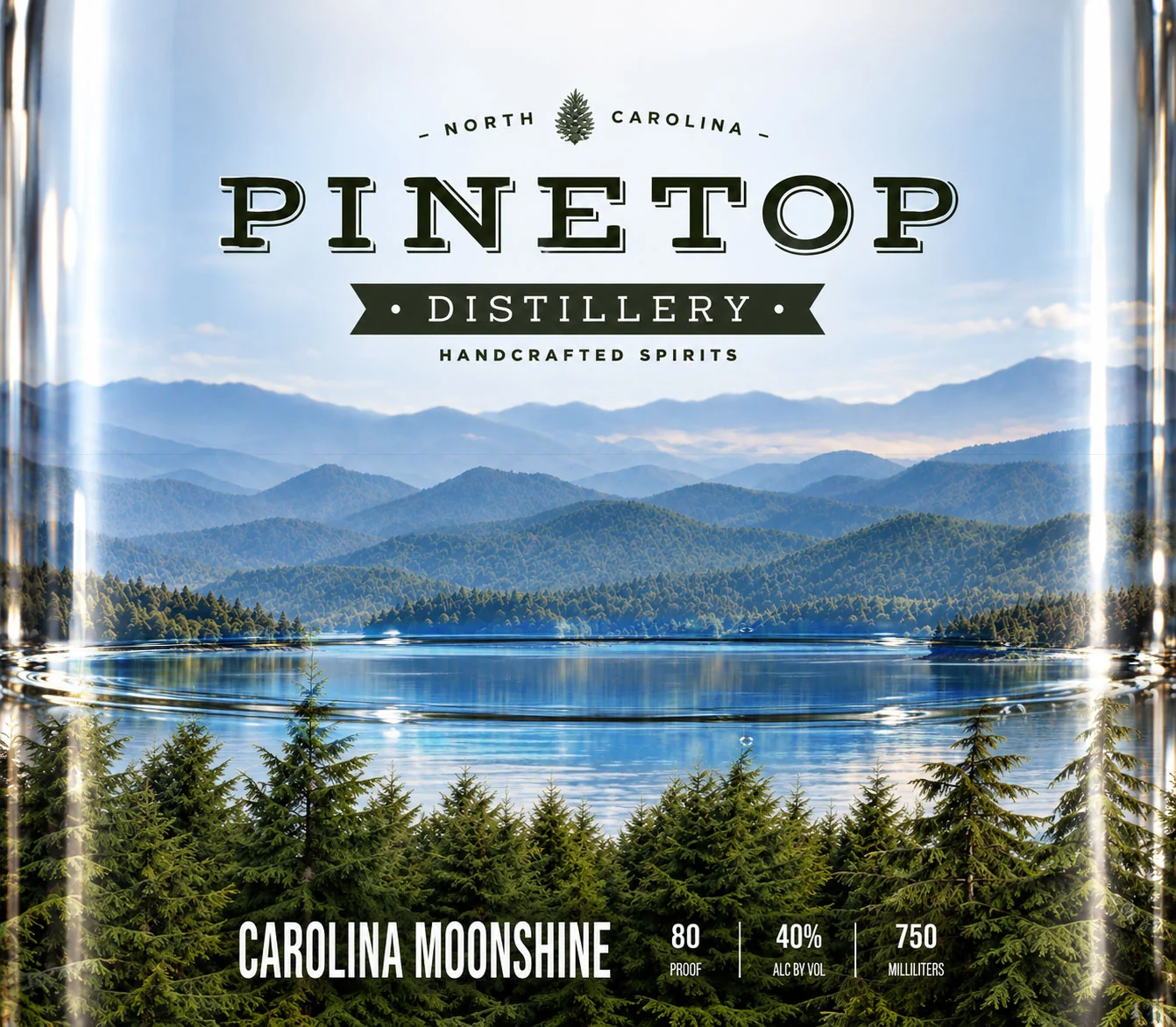
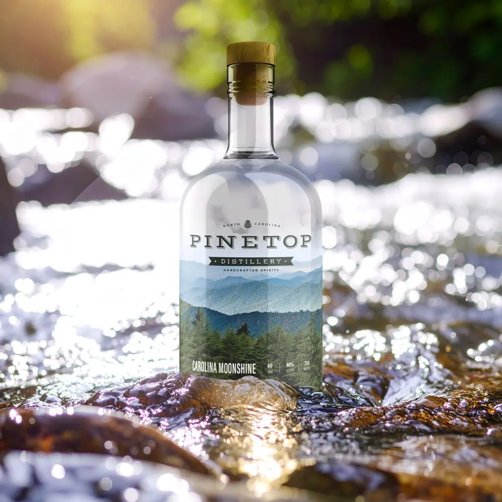
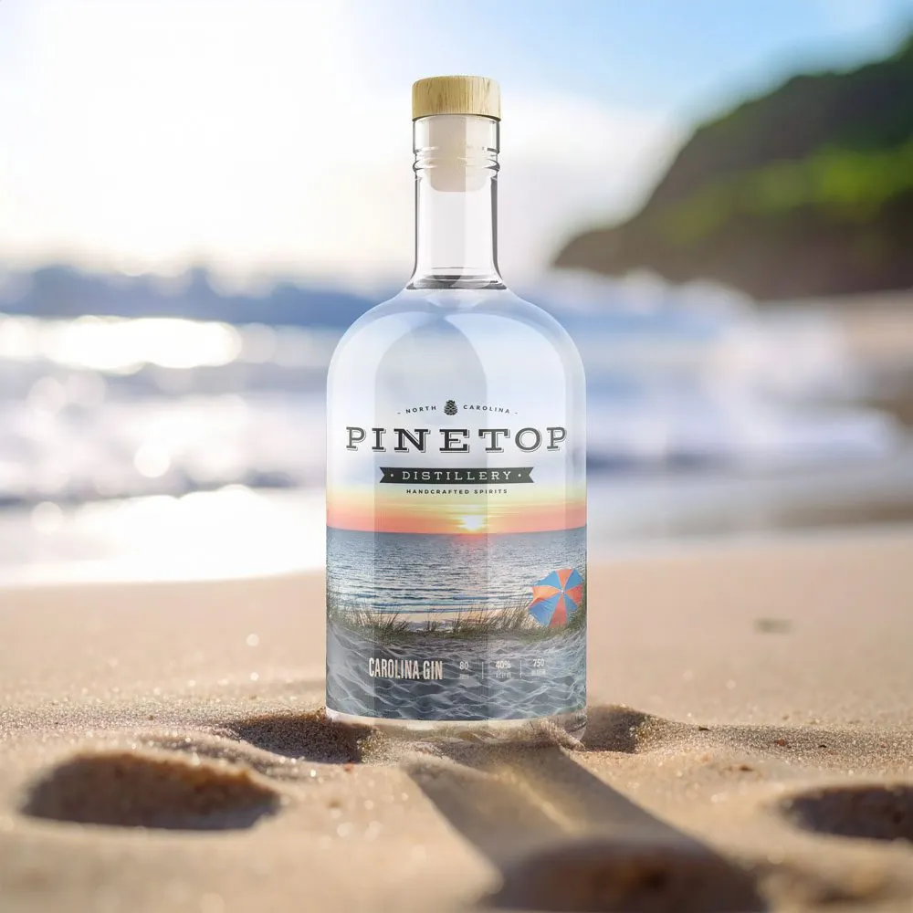
Each bottle wears two labels. The front is clear, with the logo and a stand of pines printed over a white undercoat so they hold up against the glass. The back carries the far view. You look through one, through the spirit, to the other, so the landscape gets its depth from what’s in the bottle.
Full, you see the labels. As the level falls, the view opens up: a mountain lake through the moonshine, the ocean through the gin.
The detail
The bottle told the story. Every pour took you a little closer to the water, so using the product became part of the brand.
How it got made
Proved on the bottle.
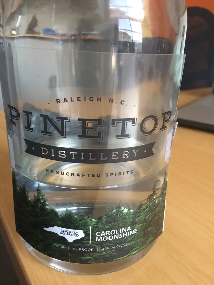
Before anything went to a printer, I printed the labels myself and wrapped real bottles, to make sure the reveal worked through glass and spirit.
| Deliverable | Format | My part |
|---|---|---|
| Front label | Clear, printed over a white undercoat | Designed |
| Back label | The far view, seen through the spirit | Designed |
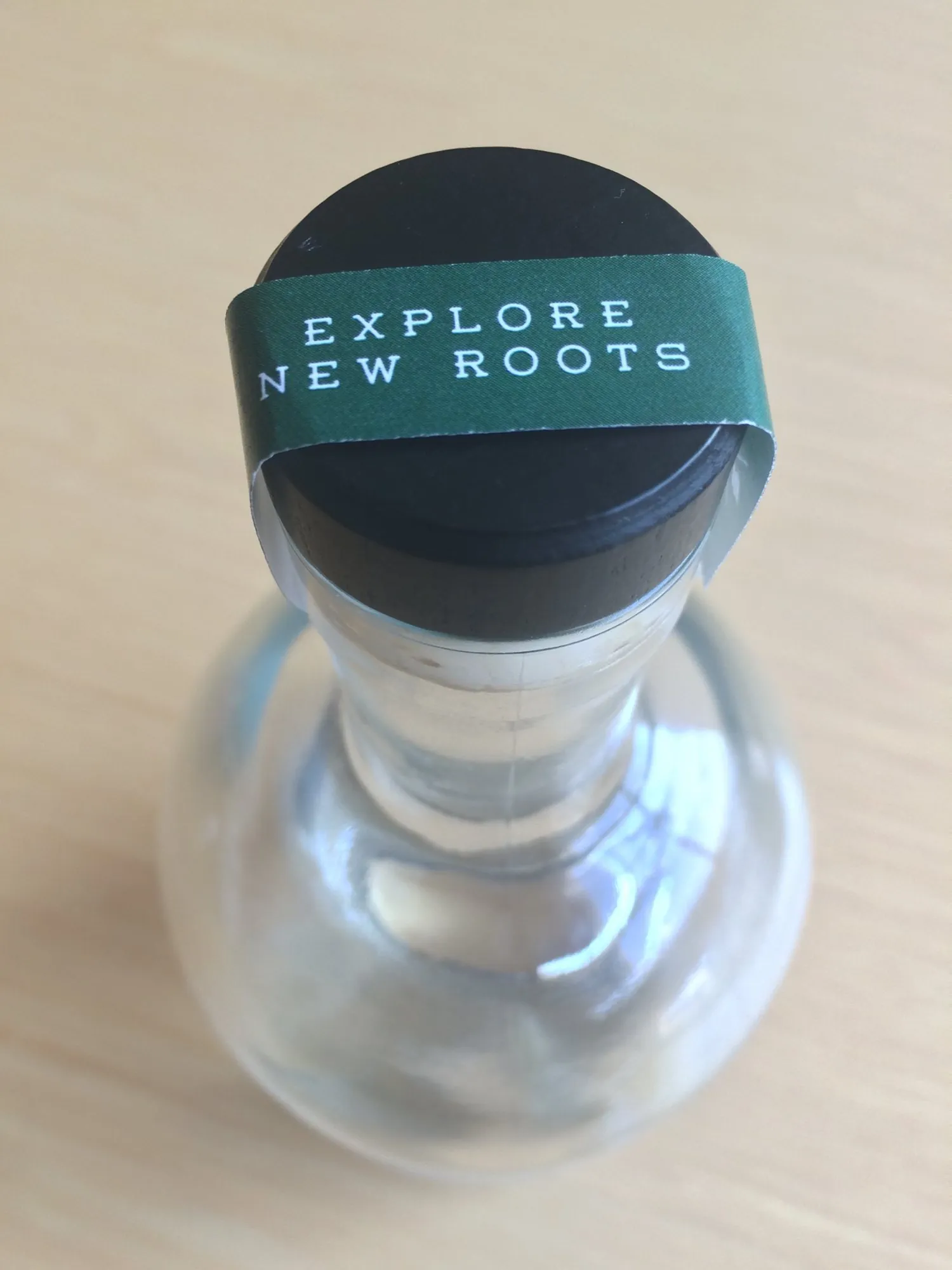
| Neck strip | Wrapped over the cap | Designed |
| Reference bottles | Hand-printed labels on real bottles | Built, to prove the reveal |
The product
Two spirits. Two legends.
Each flagship bottle tells a story of place. Carolina Moonshine looks down from the Blue Ridge, over layers of misty mountains. Carolina Gin comes in on the breeze, with golden-hour light on the Atlantic and a warm glow on the label.
Both share one label system, so the line reads as one brand on a crowded shelf.
The campaign · Concept
One spirit, one road. Ridge to rip tide.
The Pinetop Passage · Concept work
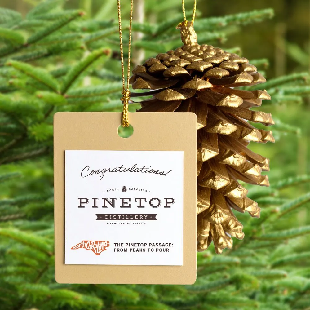
From peaks to pour.
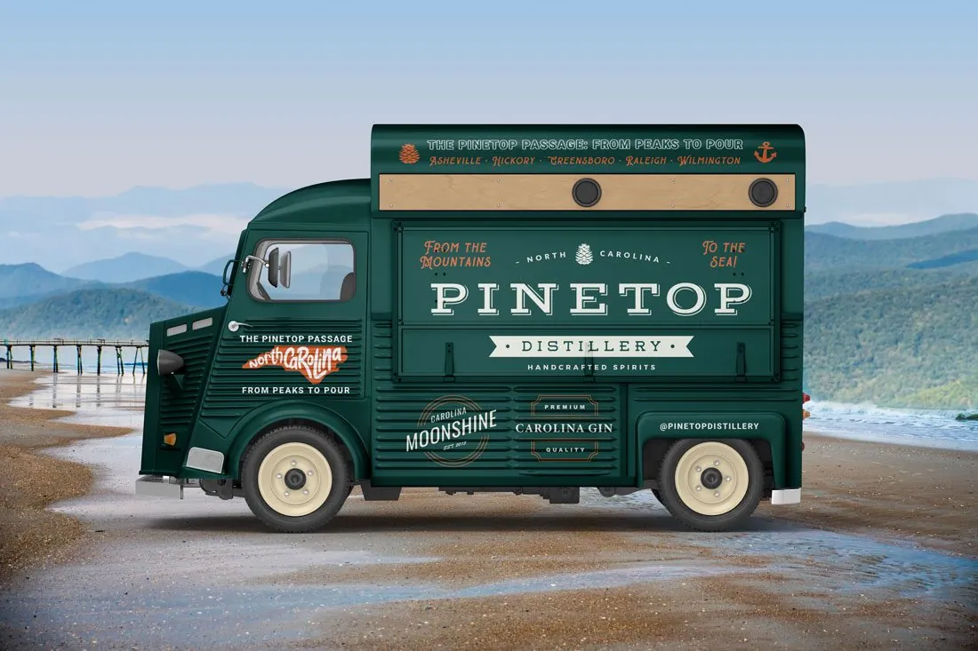
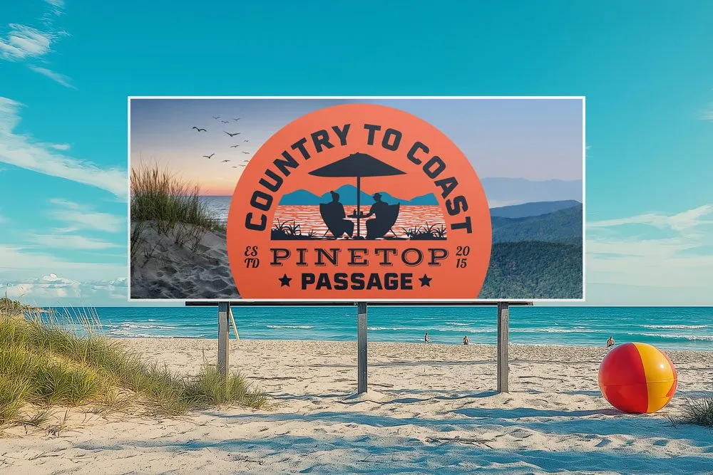
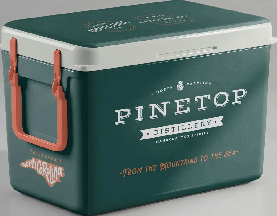
To trace the roots of the spirit across the state, I pitched the Pinetop Passage: a statewide campaign built around a custom-designed truck, with stops from the Blue Ridge Mountains to the Outer Banks. It never left the concept stage, but it’s an idea I’d pitch again.
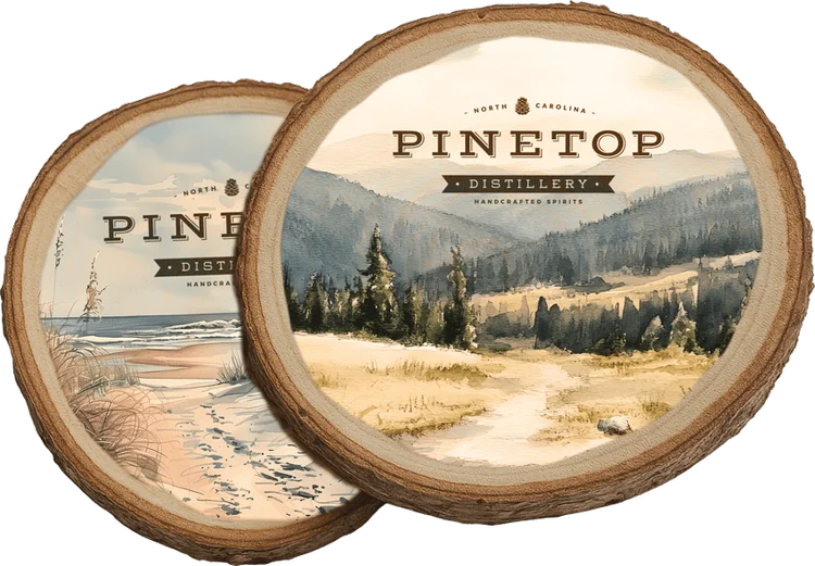
Visitors would pick up a trail passport at distilleries, bottle shops, bars and festivals, collect stamps and enter giveaways along the way. Wood-slice coasters were the giveaway. A Pinetop cooler was the prize.
- Stop 01AshevilleThe Blue Ridge. A speakeasy pop-up with exclusive infusions.
- Stop 02GreensboroThe Piedmont.
- Stop 03RaleighThe capital, and Pinetop’s home.
- Stop 04WilmingtonThe coast.
What happened
The story kept pouring.
Pinetop launched with a brand that already felt rooted, on a bottle that rewarded every pour. The Passage stayed on paper, but it mapped where the brand could go next: off the shelf and onto the road.
Why it holds together
One brand, bottle to road.
The same story runs from the label to the merch to the campaign. Meet Pinetop on a shelf or at a bar, and you’d know it.
Bring me
the problem.
Hiring a Senior Designer, Art Director, or hands-on Creative Director? If you need design strategy and the hands to carry it out, on brand down to the last file, I’d like to hear about it.
- LocationRaleigh, NC · Remote or hybrid
- Emailhello@adamhajnos.com
- LinkedInlinkedin.com/in/adam-hajnos
- RésuméView résumé